User Interfaces
UI DESIGN, PROTOTYPE & WIREFRAMES
WireFrames
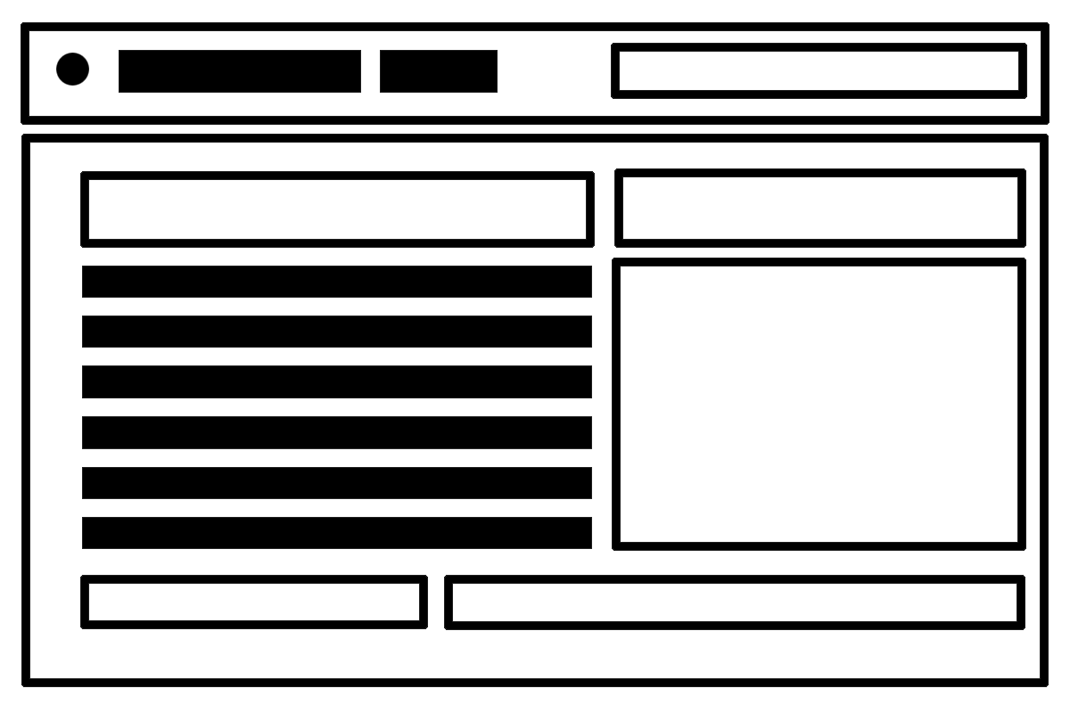
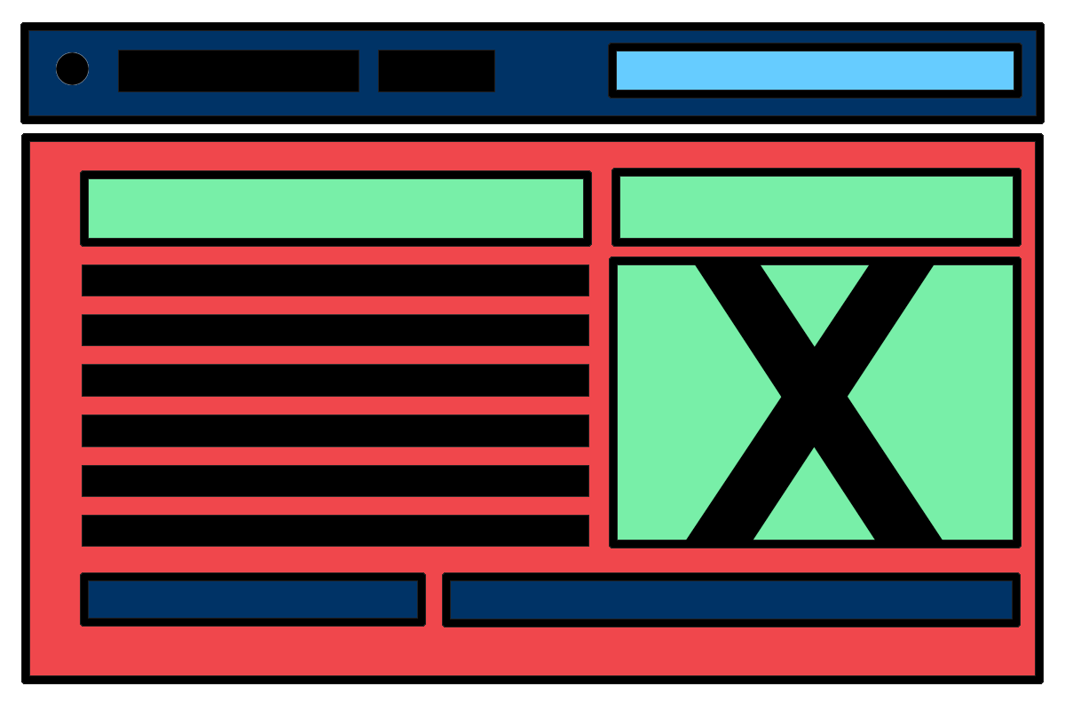
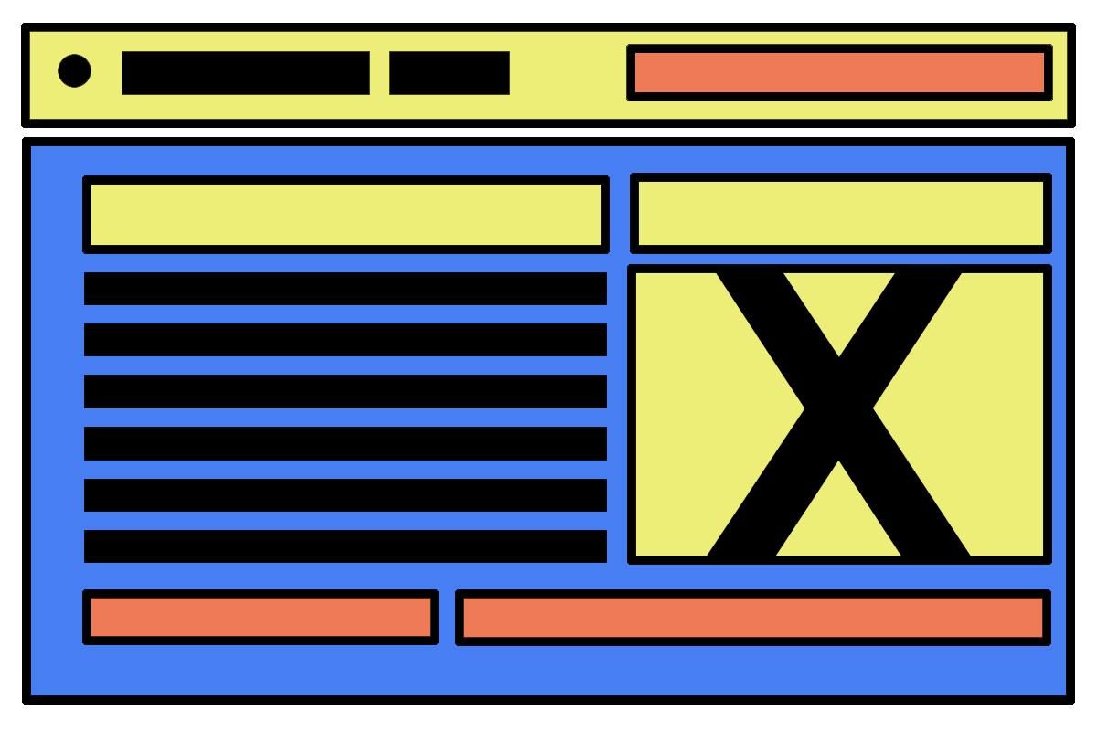
In the graphic below, are three wireframes that has low-fidelity, simplified sample design outline of a product functionality in the future. Normally you would identify it by their distinctive layouts and blocks, with the use of lines to showcase text, and ✕ marks squares showing placeholders for the actual use for users.

WIREFRAME
Wireframes may be utilized by different disciplines. Developers use wireframes to get a more tangible grasp of the site’s functionality, while designers use them to push the user interface (UI) process.

MOCKUP
A mockup is a prototype if it provides at least part of the functionality of a system and enables testing of a design. Mock-ups are used by designers mainly to acquire feedback from users.

PROTOTYPE
Prototypes offer a high-fidelity representation of your app. It’s like a mockup enriched with UX pieces, interactions, animation and anything else you’d like to experience when clicking buttons.